- Business & Data Research
- Posts
- Bitcoin Descriptive Statistics using Python
Bitcoin Descriptive Statistics using Python
Bitcoin descriptive statistics and trend shows bell curve

Descriptive statistics are a set of tools used to describe and summarize data in a meaningful way, providing insights into the characteristics of a dataset without making conclusions beyond the data analyzed. It's essentially about presenting the "big picture" through numbers, charts, and graphs.
About the dataset :
Imagine you have a dataset containing daily Bitcoin prices over the past year. Here's how you can use descriptive statistics to analyze this data:
Measures of Central Tendency: These metrics help identify the center of the data.
Mean (Average): Calculate the mean Bitcoin price by adding all the daily prices and dividing by the number of days. This gives you the average price of Bitcoin over the year.
Median: The median is the middle value when all daily prices are arranged in ascending order. It provides a robust measure of central tendency, especially in the presence of outliers.
Mode: This represents the most frequently occurring price in the dataset. While Bitcoin prices are continuous, identifying the mode can highlight price stability periods.
Measures of Dispersion: These metrics describe the spread of the data.
Range: The range is the difference between the highest and lowest prices in the dataset. It provides a sense of the price volatility over the year.
Standard Deviation: This measures the average deviation of daily prices from the mean. A high standard deviation indicates high price volatility, while a low standard deviation suggests more stable prices.
Variance: Similar to standard deviation, variance measures the spread of prices but is expressed in squared units
Visual Representations: Graphs and charts can help visualize the data.
Histogram: A histogram can display the frequency distribution of daily prices, showing how often Bitcoin traded at different price levels.
Box Plot: A box plot can illustrate the distribution of Bitcoin prices, highlighting the median, quartiles, and any potential outliers
Step 1 : Importing Required Libraries and packages
import numpy as np
import matplotlib.pyplot as plt
import pandas as pd
import seaborn as sb
Step 2 : Reading the dataset using Pandas:
bitcoin_dataset = pd.read_csv('/Users/Library/CloudStorage/OneDrive-Microsoft365/Sample Datasets Kaggle/Bitcoin/BTC-2021min.csv')
Step 3 : Describing the dataset using pandas library:

Step 4 : Reviewing the head of the dataset:
bitcoin_dataset.head(10)
Step 4.1 : Checking the shape of the bitcoin dataset :
bitcoin_dataset.shape
(610782, 9)
Step 5 : Checking the information of all the variables in the bitcoin dataset:
bitcoin_dataset.info()
Step 6 : Perform the EDA (Exploratory Data Analysis)
plt.figure(figsize=(15,5))
plt.plot(bitcoin_dataset['close'])
plt.title('Bitcoin Close Price',fontsize = 10)
plt.ylabel('Price Details of BitCoin')
plt.show()
Step 7: Generating large set of observations from the overall population

features = ['open','high','low','close']plt.subplots(figsize = (15,5))
for i, col in enumerate(features):
plt.plot(2,2,i+1)
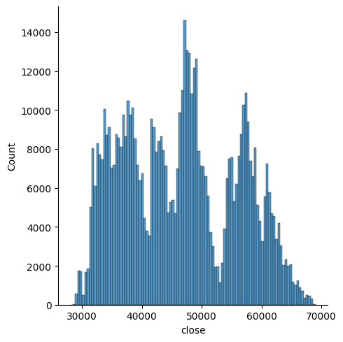
sb.displot(bitcoin_dataset[col])
plt.show()


plt.subplots(figsize = (12,5))
for i, col in enumerate(features):
    plt.subplot(2,2, i+1)
    sb.boxplot(bitcoin_dataset[col])
plt.show()
Step 8: Perform the feature engineering steps and split the data and group the data to determine the high and low values based on the year :
splitted = bitcoin_dataset['date'].str.split('-',expand=True)bitcoin_dataset['year'] = splitted[0].astype('int')
bitcoin_dataset['month'] = splitted[1].astype('int')
bitcoin_dataset.head(10)Step 9 : Below is the head of the dataset after splitting into years and group by clause:

Step 10: Check the highest value of bitcoin based on the dataset, since 2021 onwards.
print("High Value based on years:",data_grouped['high'].mean())
print("Low Value based on years:", data_grouped['low'].mean())
Conclusion : The histogram you provided illustrates the distribution of Bitcoin closing prices over a specific period. The x-axis, labeled "close," ranges from 30,000 to 70,000, indicating the Bitcoin price levels, while the y-axis, labeled "Count," ranges from 0 to 14,000, showing the frequency of closing prices within these ranges.
Several peaks in the histogram highlight the price levels at which Bitcoin frequently traded, suggesting periods of price stability or common trading ranges. This visualization helps to understand the distribution and most common price levels of Bitcoin during the analyzed period, providing insights into its overall performance and volatility.