- Business & Data Research
- Posts
- Predicting Diabetes: A Classification-Based Approach
Predicting Diabetes: A Classification-Based Approach
Diabetes Prediction using Classification, KNN algorithm
Mahesh Gurumoorthi
October 25, 2025

About the dataset :
This dataset is designed for beginners in Machine Learning who want to practice building classification models.
It contains 1,000 anonymized patient records, each with medical and demographic features commonly associated with diabetes diagnosis.
• Building a Diabetes Prediction Model
• Practicing Data Cleaning, Feature Engineering, and EDA
• Testing algorithms like Logistic Regression, Decision Trees, or Random Forests
Step 1: Importing Required Libraries and Packages
Step 2: Reading the dataset using Pandas:
diabetes_data.head()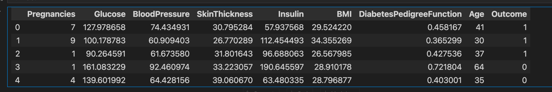
diabetes_data.describe()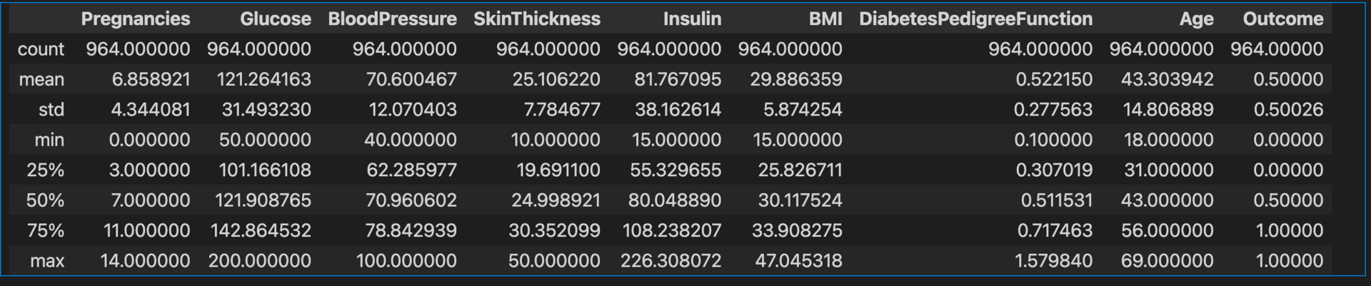
diabetes_data.info()
diabetes_data.describe().T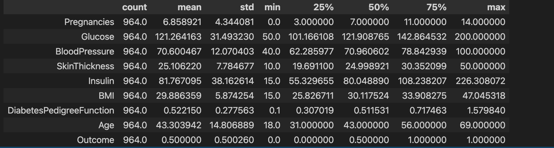
Step 3: Perform the exploratory data analysis and validate the null values existing in the dataset before modelling
diabetes_data.isna().sum() 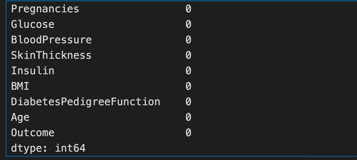
diabetes_data_copy = diabetes_data.copy(deep=True)diabetes_data_copy.head()
diabetes_data_copy.describe()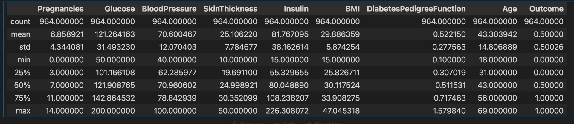
diabetes_data_copy.isna().sum()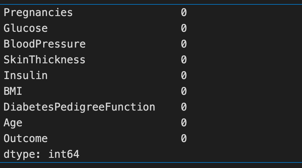
Note: Checked both diabetes_data and diabetes_data_copy and it has no '0' values
p = diabetes_data_copy.hist(figsize=(20,20))
Note :
Skewness: It is classified into two types: left and right skew.
Left Skewness: It has a long left tail, and it is called a negatively skewed line. This is because there is a long trail line in the negative direction, and the mean is also in the left peak
Right Skewness: It has a long right tail and it is called a positively skewed line. This is because there is a long trail line in the positive direction, and the mean is also in the right peak
Step 5: Plot the histogram view of the Data types of count
plt.figure(figsize=(10,6))
sns.countplot(y = diabetes_data.dtypes, data=diabetes_data)
plt.title('Data Types Count')
plt.ylabel('Data Types')
plt.xlabel('Count of each Data Type')
plt.show()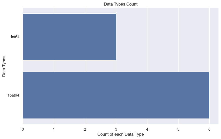
Step 6: Visualizing missing values using the missingno library
import missingno as msno
msno.bar(diabetes_data)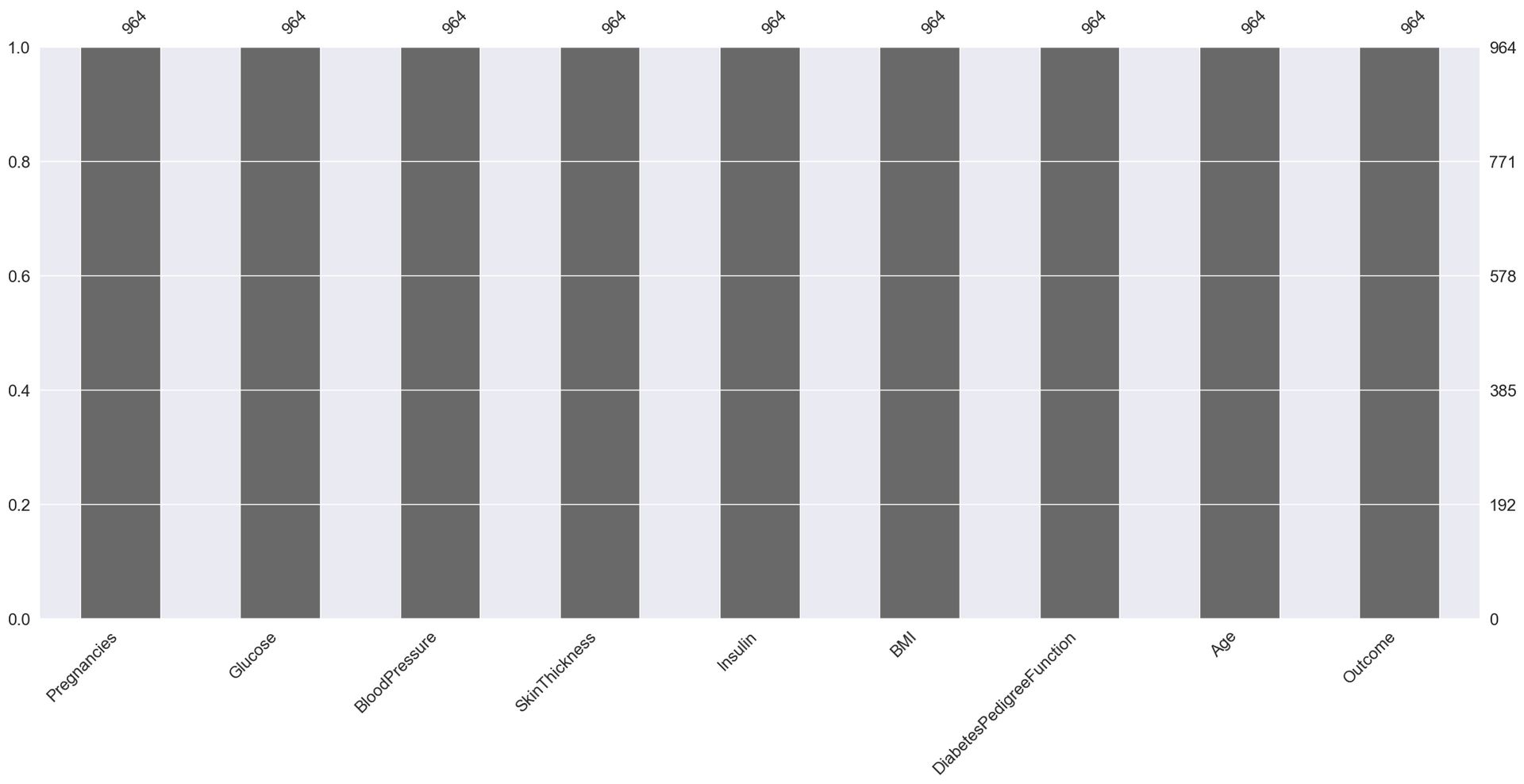
color_wheel = {1: "#0392cf", 2 : "#ff7f0e"}
colors = diabetes_data['Outcome'].map(lambda x: color_wheel.get(x + 1))
print(diabetes_data['Outcome'].value_counts())
p = diabetes_data.Outcome.value_counts().plot(kind="bar",
                                             figsize=(8,5),
                                             color=["#0392cf", "#ff7f0e"])
plt.title("Diabetes Outcome Distribution")
plt.xlabel("Outcome (0 = No Diabetes, 1 = Diabetes)")
plt.ylabel("Count")
plt.show()

Outcome
1    482
0    482
Name: count, dtype: int64
Note: The above histogram shows that the data is not biased and is equally split
Step 7: Perform the scatter matrix of all the data
from pandas.plotting import scatter_matrix
scatter_matrix(diabetes_data, figsize=(20, 20))
plt.show()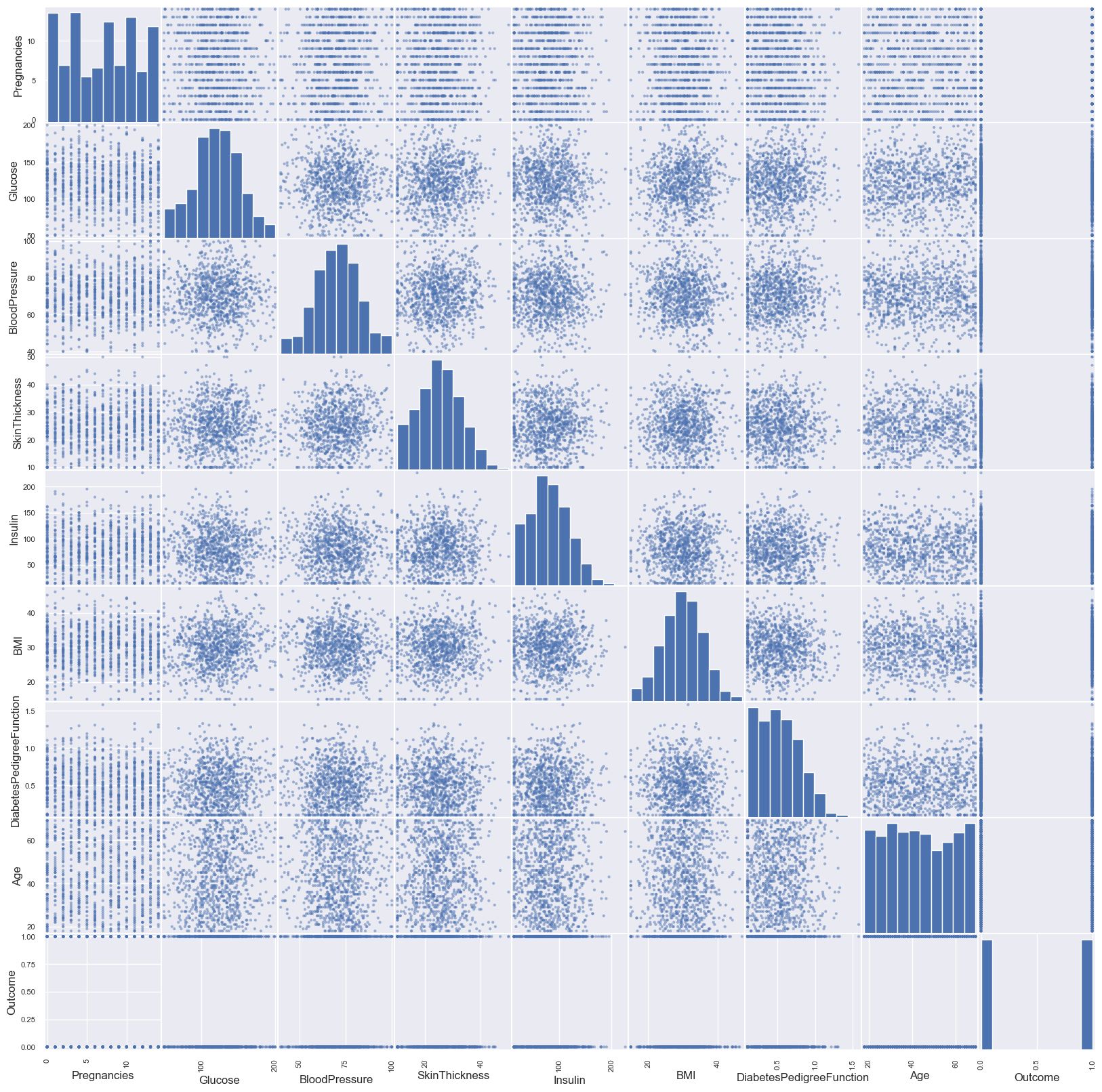
Step 8: Perform the pair plot using the diabetes data (cleaned data)
Note: Pair Plot: Pair plots are represented on the two basic figures, the histogram and scatter plot. The histogram on the diagonal allows us to see the distribution of single variable, while scatter plots on the upper and lower triangles show the relationship between two variables
pr = sns.pairplot(diabetes_data_copy, hue='Outcome')
Hint:
Pearson Correlation Coefficient: This helps to find the relationship between two variables. It gives the measure of strength of association between two variables. The value of the Pearson Correlation Coefficient can be between -1 and +1, which means they are highly correlated, and 0 means no correlation.
HeatMap: A heatmap is a two-dimensional representation of information with the help of colours. Heat maps can help the user visualize simple or complex information
Step 9: Perform the correlation matrix
plt.figure(figsize=(10,6))
p = sns.heatmap(diabetes_data.corr(), annot=True, cmap ='RdYlGn')
plt.title("Diabetes Data Feature Correlation Heatmap", fontsize=16)
plt.show()
diabetes_data.corr()
Hint:
Scaling the data: data Z is rescaled such that mu (mean) = 0 and sigma = 1. Difference between xi and mu(mean) divided by sigma
Step 10: Standardization is essential before modelling because it ensures that all features contribute equally to the model, especially when they’re measured on different scales. Without it, models can become biased toward features with larger numeric ranges
from sklearn.preprocessing import StandardScaler
sc_X = StandardScaler()
X =  pd.DataFrame(sc_X.fit_transform(diabetes_data_copy.drop(["Outcome"],axis = 1),),
        columns=['Pregnancies', 'Glucose', 'BloodPressure', 'SkinThickness', 'Insulin',
       'BMI', 'DiabetesPedigreeFunction', 'Age'])
Step 10: Split the training and testing data before modelling.
Train test split: Unknown datapoints to test the data, rather than testing with the same points with which the model was trained. Ideally 70-30 principle is used.
Cross Validation: When a model is split into the training and testing, it is possible that a specific type of data point may go entirely into either the training or the testing portion. This would lead the model to perform badly; hence, overfitting and underfitting problems can be well avoided with cross-validation techniques
Stratify: This parameter makes a split so that the proportion of values in the sample produced will be the same as the proportion of values provided in the parameter stratify.
For instance, if a variable is a binary categorical variable with values of 0 and 1, then there are 25% of zeros and 75% of ones. It stratifies will be equal to y, this will make sure that the random split has 25% of 0’s and 75% of 1’s
from sklearn.model_selection import train_test_split
X_train, X_test, y_train, y_test = train_test_split(X, y, test_size=0.3, random_state=42, stratify=y)
from sklearn.neighbors import KNeighborsClassifiertest_scores = []
train_scores = []
for i in range(1,15):
knn = KNeighborsClassifier(n_neighbors=i)
knn.fit(X_train, y_train)
train_score = knn.score(X_train, y_train)
test_score = knn.score(X_test, y_test)
train_scores.append(train_score)
test_scores.append(test_score)## score that comes from the testing data on the same datapoints on which model was trained
## score that comes from the testing data on the same datapoints on which model was tested solely
Step 11: Validation Result
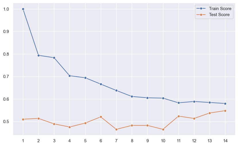
Outcome of the above line plot :
The best result is captured at k = 6 hence 6 is used for the final model
knn = KNeighborsClassifier(n_neighbors=6)
knn.fit(X_train, y_train)
knn.score(X_test, y_test)

0.5206896551724138
Step 12: Confusion Matrix
from sklearn.metrics import confusion_matrix, classification_report
y_pred = knn.predict(X_test)
confusion_matrix(y_test, y_pred)
pd.crosstab(y_test, y_pred, rownames=['Actual'], colnames=['Predicted'], margins=True)
from sklearn import metrics
y_pred = knn.predict(X_test)
conf_matrix = metrics.confusion_matrix(y_test, y_pred)
p = sns.heatmap(conf_matrix, annot=True, fmt="d")
plt.title("Confusion Matrix")
plt.ylabel('Actual Values')
plt.xlabel('Predicted Values')
plt.show()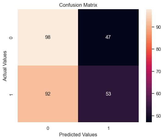
Hint :
 TP – True Positives
    FP – False Positives

    Precision – Accuracy of positive predictions.
    Precision = TP/(TP + FP)
  F1 Score (aka F-Score or F-Measure) – A helpful metric for comparing two classifiers.
    F1 Score takes into account precision and the recall.
    It is created by finding the the harmonic mean of precision and recall.

    F1 = 2 x (precision x recall)/(precision + recall)
from sklearn.metrics import classification_report
print(classification_report(y_test, y_pred))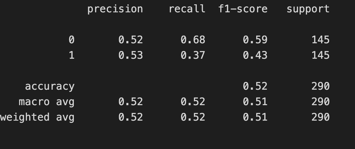
Step 13: Perform ROC - AUC Curve
from sklearn.metrics import roc_auc_score
plt.plot([0,1],[0,1],'k--')
plt.plot(fpr,tpr, label='Knn')
plt.xlabel('fpr')
plt.ylabel('tpr')
plt.title('Knn(n_neighbors=11) ROC curve')
plt.show()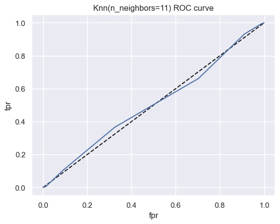
from sklearn.metrics import roc_auc_score
roc_auc_score(y_test, y_pred_prob)

np.float64(0.5056361474435196)